In 2022, COIL launched StatVentures, a first-ever venture fund for the Census Bureau. The program took years of careful planning and research, but one of the things we get the most questions about is the branding. Read on for a step-by-step, behind-the-scenes look at how we developed the visual design for StatVentures that brought the “sizzle” to the program operation’s “steak”.
Step 1: Step Back
Our first step in designing a brand system for any government program: step back and reflect on your audience and your goals.
For every new effort, COIL’s digital team (which includes me, a UX researcher and designer, a graphic and interaction designer, and a front-end web developer) takes a measured approach. We first meet with COIL’s leadership to understand our shared objectives and align on key messages. This conversation (or series of conversations) informs our guiding document: “The Creative Brief.”
The creative brief outlines the project overview, the digital team’s deliverables, audiences, key messages, the tone we aim to strike, the project’s timeline and team roles, and offers some points of inspiration to get our design brainstorm rolling. The creative brief guides us through the project and we refer back to it constantly to ensure we’re meeting deadlines, that our designs are communicating the project’s key messages and tone, and most crucially: that we’re addressing our audiences’ needs.
We identified a few key groups that we wanted to reach with the StatVentures program and brand system. Those were:
- Technologists and startups looking for opportunities to build commercial partnerships and business relationships with the federal government
- Smart people or organizations in adjacent industries who like to compete
- People or organizations who have a potential for a great solution but have never thought of working with the government before
We’ve also done quite a bit of foundational work at COIL to classify four key personas (fictional representatives of our target audiences). While our programs aim to reach all of our target audiences at some time in their user journeys, we often pinpoint a “primary audience” for our designs. For StatVentures, that is “Technologist Tim”, who is a data analyst for a social impact healthtech company. He is a frequent user of Census data to understand his company’s target markets and help the product team build user-friendly tools. Tim has questions about data and ideas of how to improve Census data delivery.
Step 2: A Shared Vision
Next, after aligning on StatVentures’ audiences and key messages, we gathered our resources to inform a shared design vision.
We had a few parameters for the brand system. Firstly, StatVentures needs to fit neatly into the COIL brand with clear association to the COIL design system, including typography, color palette, and wordmark.
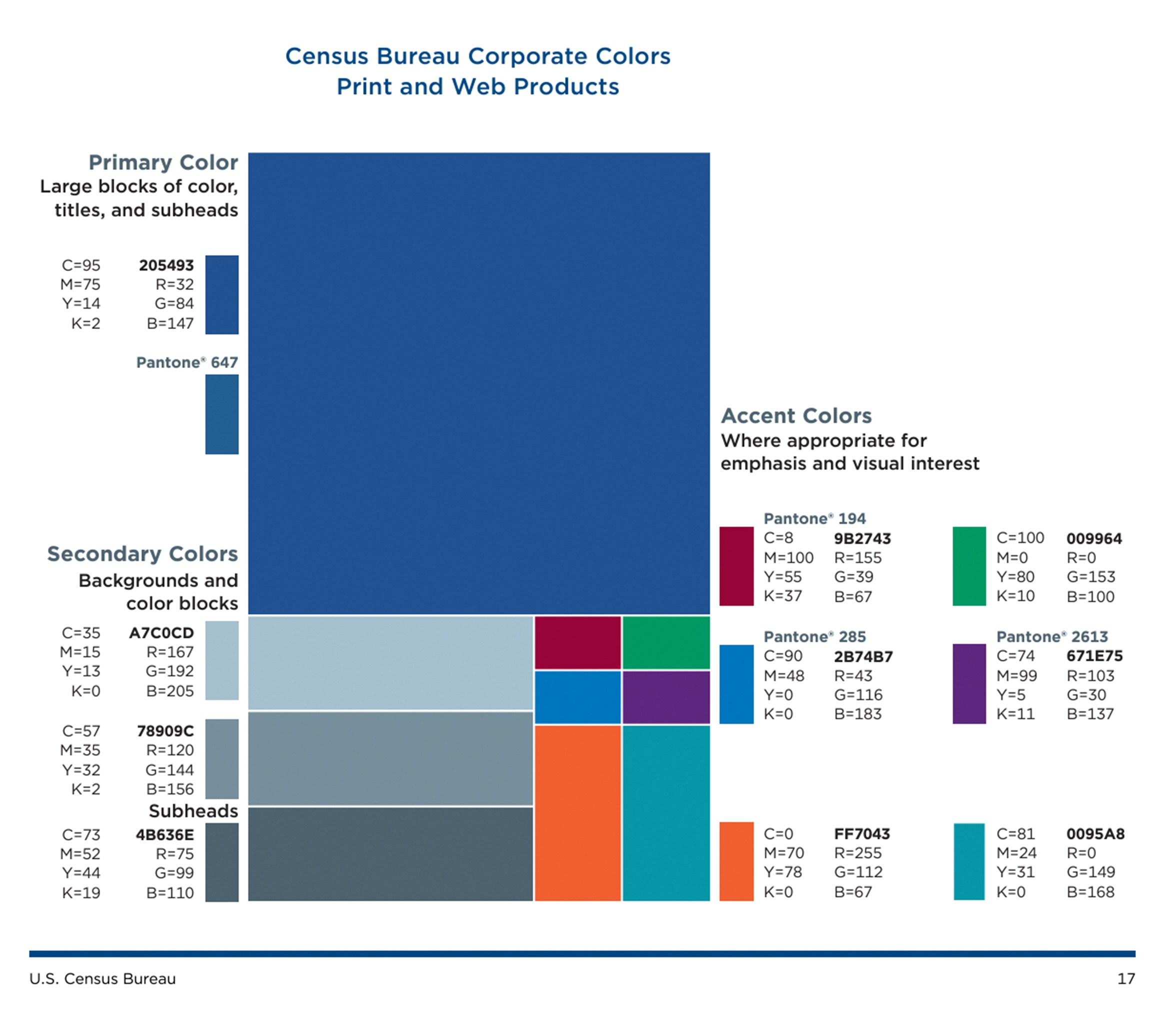
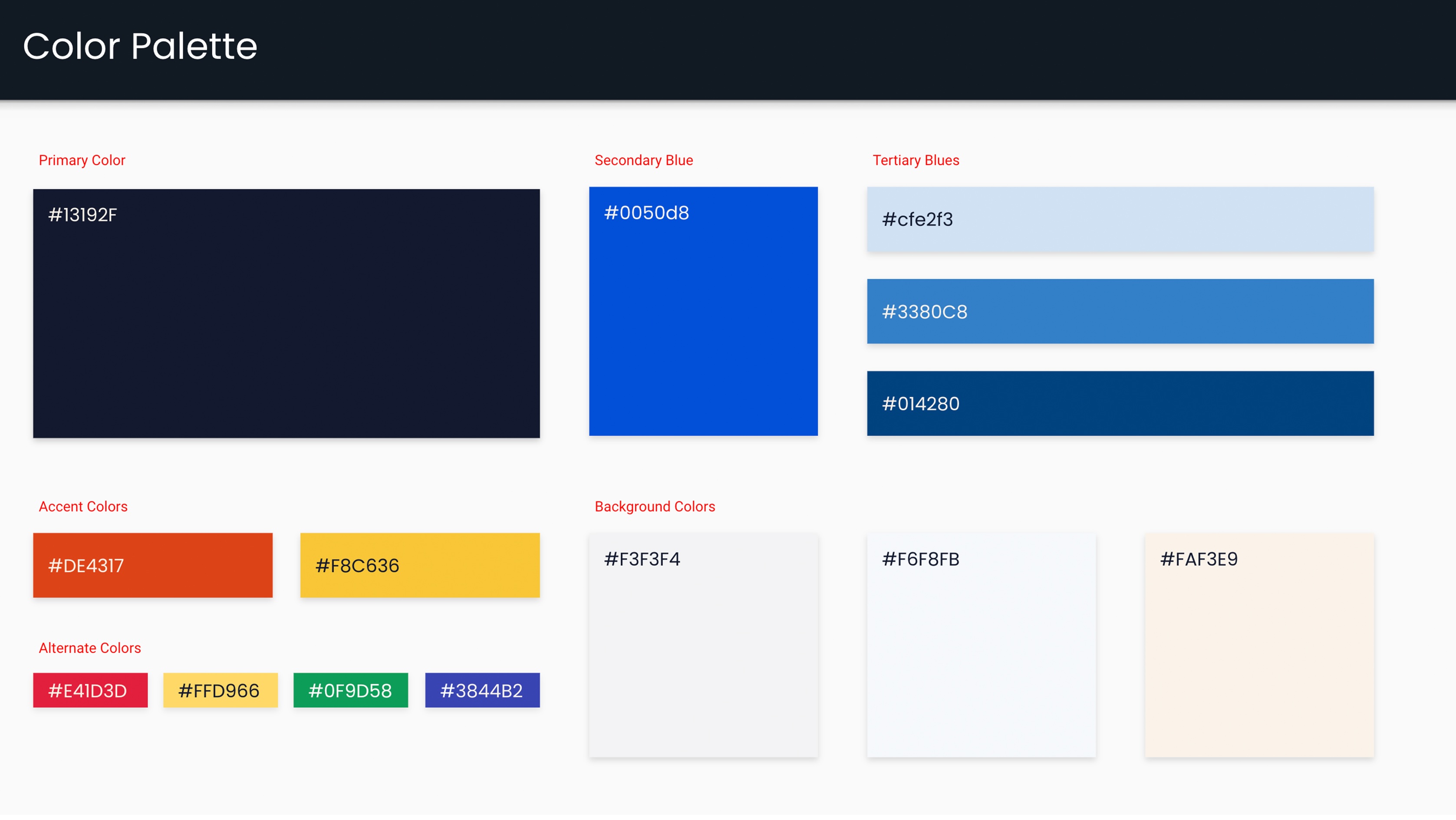
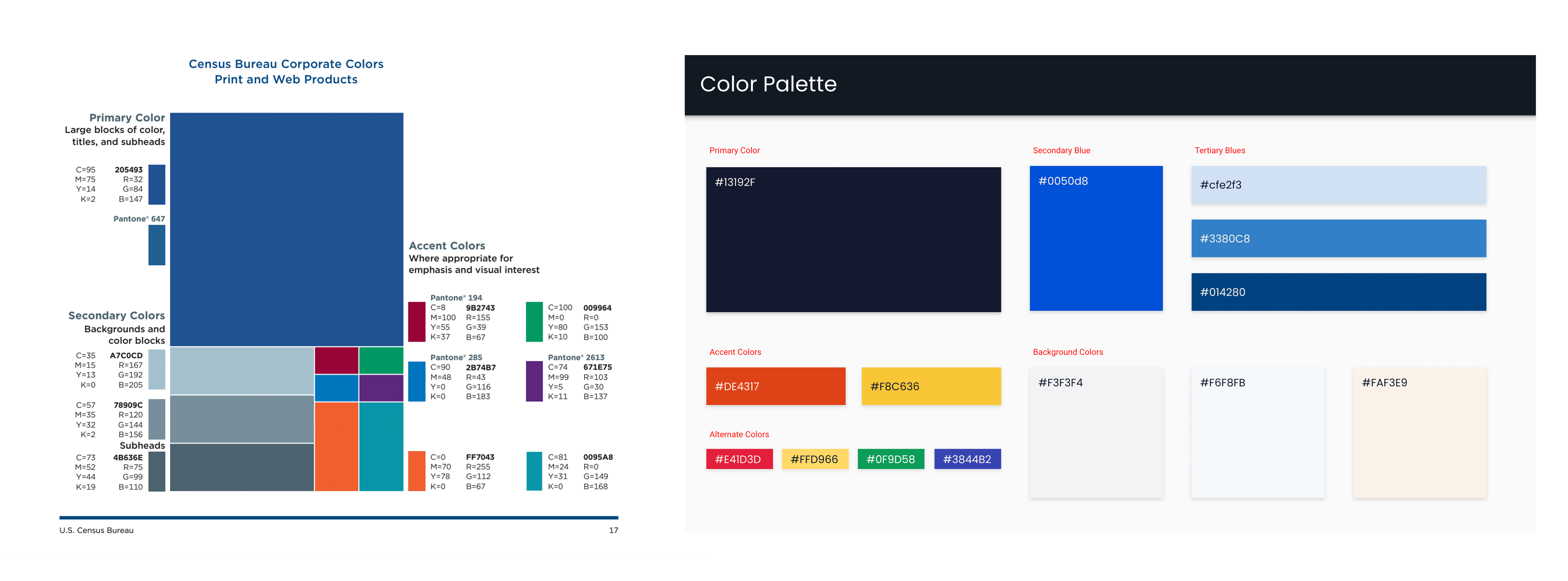
Secondly, all of our web designs and websites use the U.S. Web Design System, which informs our web colors, web components, and web accessibility (a core tenet of our web development).
Finally, we considered the visual associations between other federal venture capital initiatives to their umbrella organizations: like AFWERX at the U.S. Air Force, the Defense Innovation Unit at the Department of Defense, and In-Q-Tel (not a government entity but originally launched by the CIA), considered by many at COIL to be the gold standard for government venture funds.
With these criteria in mind, we embarked on multiple brainstorms. We aimed to strike a chord between COIL’s visual values (e.g. trustworthy, official, polished, approachable, fun, and positive) and StatVentures’ evocative characteristics (e.g. analytical, speedy, efficient, technical, streamlined, and low-risk). The marriage of these values is reflected in our designs that are intended to be both engaging and refined, striking a balance between confident and approachable.
Our brainstorms led us to a shared vision for the StatVentures brand: a nod to the Census Bureau’s 19th-century technological innovation with a 21st-century approach.
Step 3: Find Inspiration at Your Agency
The Census Bureau is rich with inspirational individuals, accomplishments, and innovations from which to draw. To inform the StatVentures brand, we narrowed in on the Census Bureau’s long history of technology innovation.
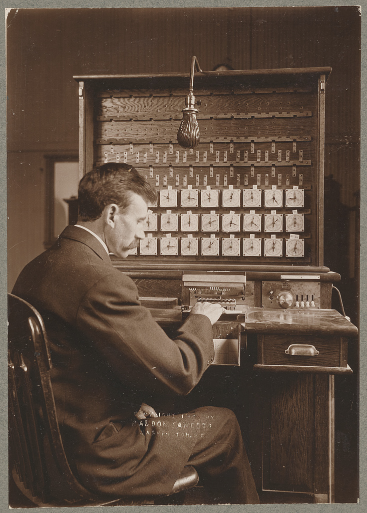
As far back as the late 1800s, the Census Bureau posed challenges to the American people to identify more efficient methods to process unprecedented data. After the 1890 Decennial Census, Herman Hollerith, a former Census Bureau employee, answered the call with his electro-mechanical tabulating machine.
The Hollerith Machine revolutionized the bureau’s data processing* and some 133 years later, served as the brand inspiration for StatVentures, the Census Bureau’s newest challenge to the American people.
Honoring history when designing a brand for government initiatives conveys a few central messages. We communicate credibility, continuity, and reliability to the public; and we highlight the Census Bureau’s long-held core values, principles, and goals.
We aimed to honor the Census Bureau’s past achievements while ensuring the brand reflects StatVentures’ core traits and goals. By blending history with modern design, we convey a sense of progress and innovation in this century while maintaining a strong foundation rooted in past centuries.
*Side note: While we took inspiration from the Hollerith Machine’s mechanics and innovations, that machine transformed data processing methods within the bureau, rather than the innovations in data collection that we currently seek at StatVentures.
Step 4: Solicit Feedback, Iterate, Repeat
Inspired by Census Bureau technological innovation and machinery, we next embarked on designing a first draft of the brand system. To ensure we were on the right path and meeting our core objectives, we solicited feedback from senior leadership. We employed an “I Like, I Wish, I Wonder” critique format in which participants noted what they liked about the design, what they wished to see, and what they wondered we could try.
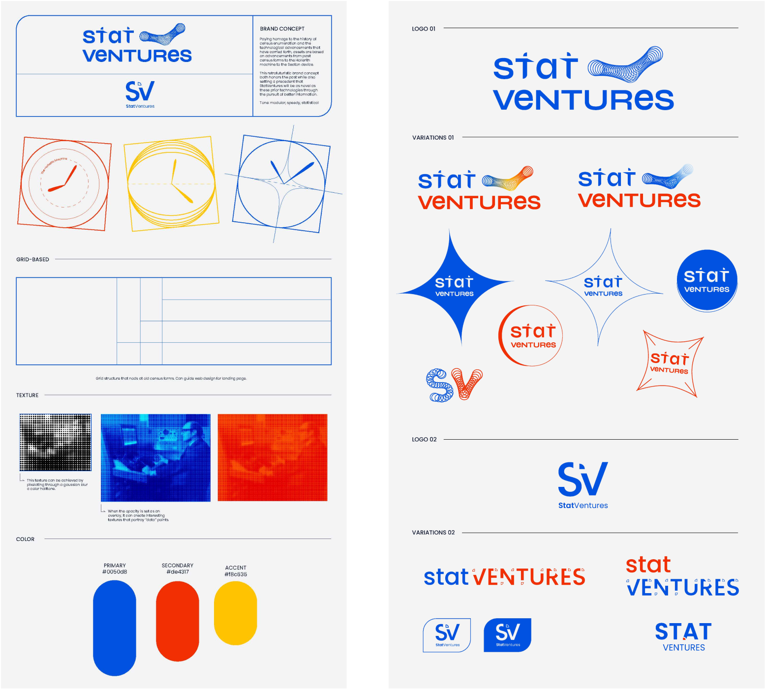
Insights from the group were fundamental to later iterations and the final version of the brand you see today. Feedback included requests for a more serious color palette that downplayed the primary color scheme and added deeper blues, suggestions to revise the logo treatments to be less cluttered and “cutesy”, and a clear consensus for references to the enumeration machines to be more overt.
As we considered our target audiences of tech innovators and statistically-minded individuals, we refined the logo treatments, color palette, and infused elements of the bureau’s technological history throughout StatVentures’ logo, iconography, and imagery.
Take a closer look at archival images of Hollerith’s invention to see many references to its intricate mechanics in StatVentures’ final brand system. You’ll see our homage to the machine’s tabulator dials in the StatVentures logo letter “A”, in the pattern iconography splashed across our digital assets (and this blog post’s header), and in the markers indicating the three phases of every StatVentures challenge.
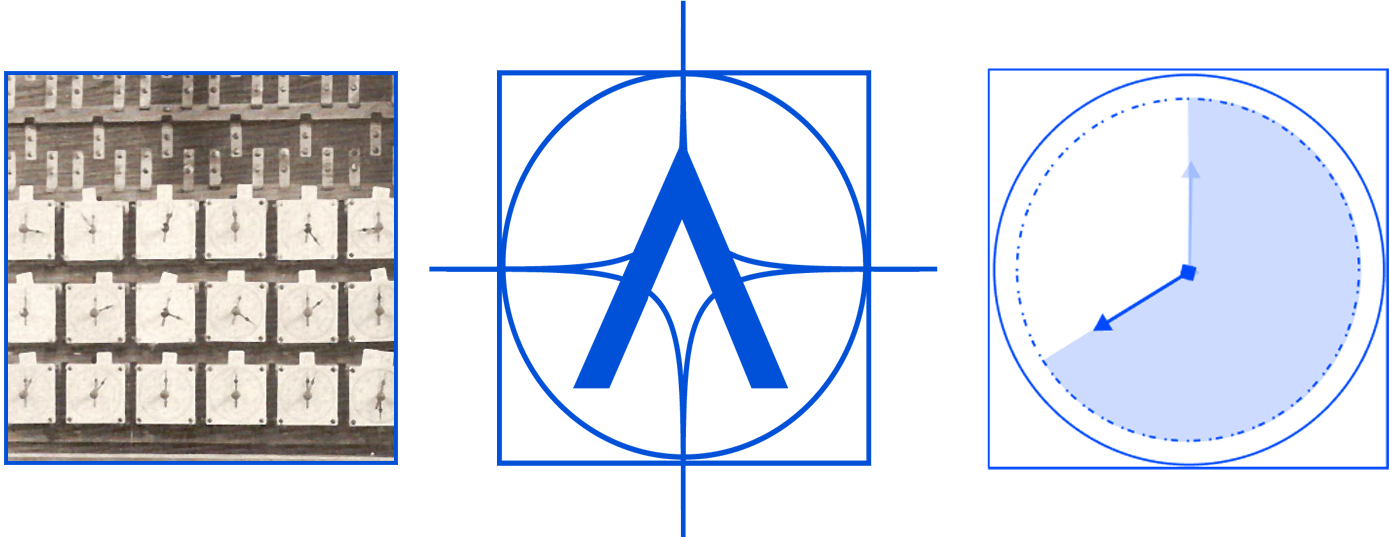
We’ve also manipulated and incorporated historic images of Census tabulators at work on the next iterations of Census Bureau machines – the UNIVAC and FOSDIC – that harken back to the bureau’s past but add a futuristic texture that evokes data points.

While taking inspiration from the bureau’s accomplished history, the StatVentures brand is rooted in our present and oriented toward our future. It seamlessly integrates into the existing COIL brand, aligning with our design system’s typography and color palette while also communicating to the public our collective potential.
We hope this blog post will serve as a starter guide on how to build a brand system for government programs. Until then, don’t be a stranger: drop us a line with your thoughts on design in government.
How You Can Use This Process in Your Work
Here are some tangible steps to take back to your agency when designing a brand for government:
- Write a Creative Brief including the project’s overview, deliverables, audiences, key messages, tone, timeline, and team roles – and use it as a guide throughout the project.
- Identify Your Initiative’s Target Audience(s). People should be at the center of design, decision-making, problem solving, and participatory processes. Identify whom you most want your brand to reach and design materials that will entice and appeal to them.
- Find Visual Inspiration at Your Agency. Look to your agency’s core values, accomplishments, and history for inspiration.
- Solicit Feedback. Reach out to your senior leadership, program champions, and stakeholders for structured feedback on your ideas and first drafts. Use frameworks such as “I like, I wish, I wonder…” to help stakeholders provide useful, constructive feedback.
- If you can…Hire Design Talent! Not to put the cart before the horse – don’t forget to source design talent! If you have the budget, hiring a visual designer onto your team is invaluable to building impactful materials that inspire your audiences to take action. Even if you don’t have a dedicated designer available to you, you can adopt most of these suggestions as a program designer!
More About StatVentures
StatVentures scouts technology through collaborations with innovators outside of government to ensure the U.S. Census Bureau continues to provide the highest quality data.
StatVentures is a program of Census Open Innovation Labs, at the U.S. Census Bureau.
View our current challenges and learn more about the program at: coil.census.gov/statventures


